
Aug 6, 2026
10 Best OKR Software Tools in 2026: Ranked by Ease of Use (Including Pricing for 20 users)
After extensively testing the 10 best OKR software tools in 2026, I have ranked them by Ease of Use: Planomic, OKRs Tool, Mooncamp, Sugar OKR, Perdoo and many more.
CEO & Co-Founder

Anders Pedersen
CEO & Co-Founder at Planomic
Anders has more than 10 years of experience in technology and business development. Before co-founding Planomic, he worked with strategy, business development and project management in companies such as Beiersdorf and Ascom.
He writes about OKRs, strategy execution, and how to make goal-setting simple enough for teams to actually use.
Planomic was the easiest OKR software to use in my test, followed by OKRs Tool and Mooncamp.
- If you want the easiest-to-use OKR software, start with Planomic.
- If you want another straightforward alternative, try OKRs Tool.
- If you need more customization and can accept more complexity, shortlist Mooncamp or Perdoo.
At the beginning of my career, I was helping a mid-sized Danish company prepare to roll out a new strategy across regions and business units, after leadership had spent months formulating the strategy. My job was to find a goal-setting system that could translate those priorities into something teams could actually work with.
Quickly, the OKR framework felt like the obvious answer. I was strongly influenced by Radical Focus by Christina Wodtke, and the logic behind OKRs was compelling. The difficult part was not choosing the framework. It was choosing the software.
What I found was a frustrating trade-off. Documents and spreadsheets were easy to start with, but they quickly turned into maintenance chaos. Updates were missed, different versions circulated, and the overview disappeared across tabs and files. The more advanced strategy execution platforms solved the structure problem, but created another one: they were too heavy, too complex, and too difficult to introduce without significant training.
That experience has shaped how I evaluate OKR tools. The best OKR software is not the one with the longest feature list. It is the one teams can understand quickly and keep using after the first check-in cycle. That is why, in this guide, I have tested and ranked the 10 best OKR software tools by Ease of Use.
How I evaluated the OKR tools
I tested every OKR tool using the same workflow. For each tool, I signed up and completed four tasks:
- Create an Objective and 3 Key Results
- Complete a Check-In
- Review the reporting and progress views
I focused on Objectives, Key Results, and Check-Ins because these make up the core workflow of the an OKR system. After creating an OKR, I reviewed each software’s reporting features to see how easily I could understand the current state of the OKRs. Could I quickly tell what was on track, what was falling behind, and where attention was needed?
I have included screenshots from each step so you can see the actual experience rather than relying only on my description.
Based on this test, I scored each OKR tool from 1 to 5 stars for ease of use:
- ★★★★★ — Extremely easy to use
- ★★★★☆ — Easy to use
- ★★★☆☆ — Average
- ★★☆☆☆ — Difficult to use
- ★☆☆☆☆ — Very difficult to use
Of course, ease of use is subjective. What I think is “easy to use”, may not work as well for another. I therefore recommend that you shortlist 2–3 OKR tools and repeat this test yourself. You can usually tell quite quickly which one feels right for your team.
With that out of the way, here is how the tools ranked.
Best OKR Software ranked by Ease of Use
| OKR software | Summary | Price for 20 users | Ease of Use |
|---|---|---|---|
| Planomic | Most intuitive in the test, with focused OKRs and strong check-ins. | Free for 1 team and unlimited users; more than 1 team: €49/month | ★★★★★ |
| OKRs Tool | Straightforward OKR structure, but it still needs more polish. | $49/month | ★★★★☆ |
| Mooncamp | Powerful, but the OKR experience feels too busy and layered. | €140/month equivalent, billed annually | ★★★☆☆ |
| Sugar OKR | Clear single-OKR view, but weak check-ins and limited reporting. | Free | ★★★☆☆ |
| Perdoo | Capable, but heavier and less clean than simpler OKR tools. | €160/month on quarterly billing | ★★★☆☆ |
| Oboard | Structured and Jira-oriented, but only average in core usability. | $140/month | ★★★☆☆ |
| Google Sheets & Excel | Easy to start with, but weak as a real multi-team OKR system. | Free | ★★★☆☆ |
| Tability | Strong features, but the core OKR workflow feels hidden. | $140/month | ★★☆☆☆ |
| Profit.co | Broad suite, but weak bespoke units and thin default reporting. | Custom pricing; 30-day free trial | ★★☆☆☆ |
| Weekdone | Unclear interface and no real OKR check-in flow. | $192/month for the 20-user package | ★☆☆☆☆ |
Prices use the “lowest” plan that supports 20 users. Where a vendor publishes monthly billing, we use that. Where a vendor only publishes annual or quarterly terms, we note the billing constraint in the cell.
We only included platforms that offered a free trial. WorkBoard, Lattice, and Betterworks did not make the list, not because they are bad, but because they required a sales demo to explore. I wanted to focus on tools you can test right now.
Why not Quantive, Viva Goals, or Teamflect?
We have not included Viva Goals because Microsoft retired it on December 31, 2025, so it is no longer a current option to recommend in 2026.
We have also left Quantive out of this specific table even though it still exists as a product. That is an editorial choice: after WorkBoard acquired Quantive on May 28, 2025, the overlap between the two became significant enough that including both would overrepresent the same enterprise category in one ease-of-use ranking.
We have also excluded Teamflect from this table because it is fundamentally a Microsoft Teams-native product rather than a general-purpose OKR tool.
In the following, please find my comments and screen shots from the testing of each of the OKR sofware tools.
1. Planomic
Website: Planomic.com
Ease of use: ★★★★★
Summary: Planomic was by far the easiest-to-use OKR software in my test. Its team-first structure, support for draft OKRs, focused one-by-one OKR view, and confidence-based team check-ins make the workflow unusually clear and well aligned with OKR best practices. The result is a highly intuitive tool that helps teams stay focused and build a strong OKR cadence from the beginning.
Creating the Objective and Key Results
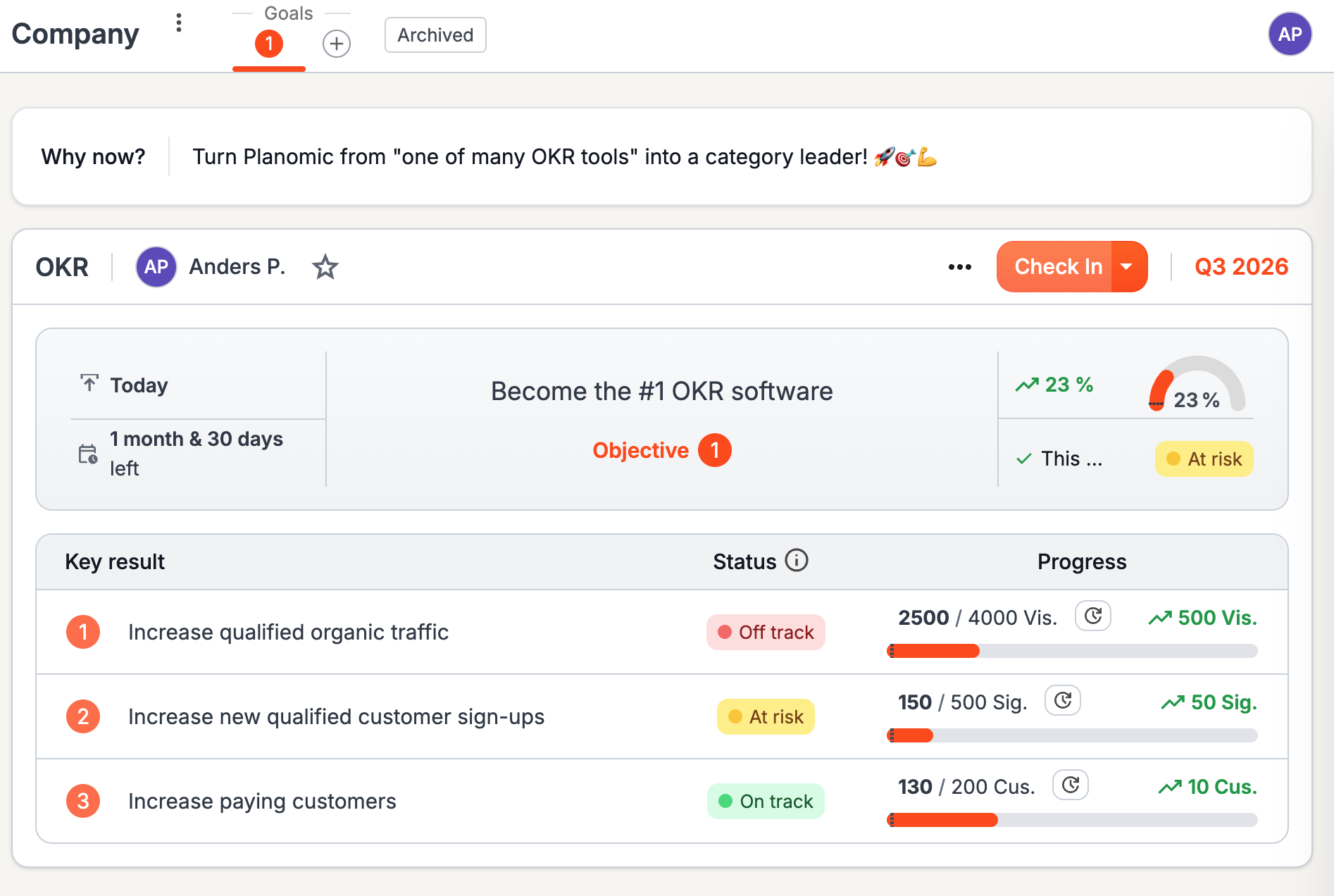
Planomic’s OKR view is built on two core beliefs: OKRs should be defined by teams, not individuals, and each team should have as few OKRs as possible, in order to stay focused. That is why the default view shows OKRs one by one. To move between them, the user clicks the corresponding OKR number, for example 1.
Every new Objective starts as a draft. This is where you can explore ideas and refine wording without committing to the OKR yet. Any draft OKR is marked Draft and only becomes part of reporting and overviews once it is published. Planomic is the only OKR software on the market that supports draft OKRs.
Publishing an OKR is simple: just press the Publish button. After publication, the OKR can still be edited in draft mode, so changes only become visible once they are published again.
Once an OKR is published, the most important elements are visible immediately: the owner, the check-in, and the ending quarter. The Objective card also brings together the key things to monitor during an OKR cycle, including how long ago the Objective was published, how much time is left, overall progress, and the latest overall Check-In status, which is based on the average of the Key Result check-in scores.
Underneath the Objective, a simple Key Result table shows each result’s status, current value versus target, progress bar, and movement since the last progress update.
A unique feature of Planomic is the dedicated “Why now?” field above the OKR, which provides the context needed to understand why the team has chosen this OKR over other possible priorities.
Creating a Check-In
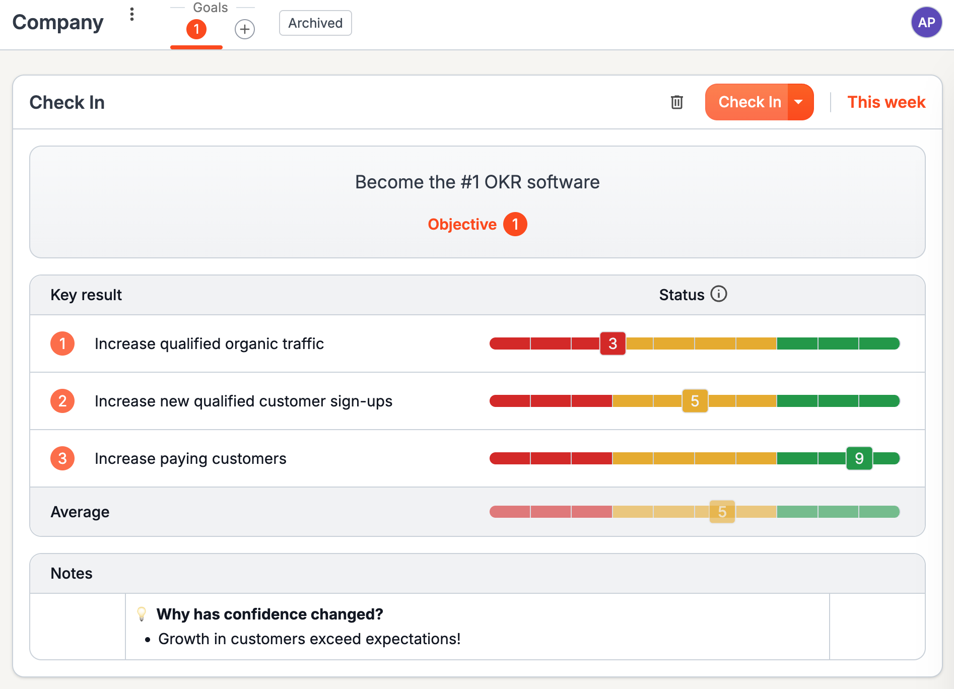
Planomic is also unique in the way it handles check-ins. In my test, it was the only tool that lets users create a check-in at the OKR level rather than separately for each Key Result, as most other tools do. The idea is that a check-in should be a medium for team discussion and therefore something the team completes together.
It was also the only tool in my test that lets users select a confidence score for how likely a Key Result is to be achieved by the deadline. Most other tools only offer a simple status such as on track, at risk, or off track. That is not fully aligned with OKR best practices. Christina Wodtke, author of Radical Focus, recommends a confidence-based approach of the kind Planomic offers.
To create a Check-In, the user simply presses the Check in button in the upper-right corner of the OKR in focus. The user then sets a confidence level from 1 to 10 for each Key Result, using a red-yellow-green confidence scale. This naturally sparks discussion: why are we more confident than last time, or less? Any learning can be captured in the notes area underneath to explain what changed and why. In this way, the team continuously learns what works and what doesn’t.
Reporting
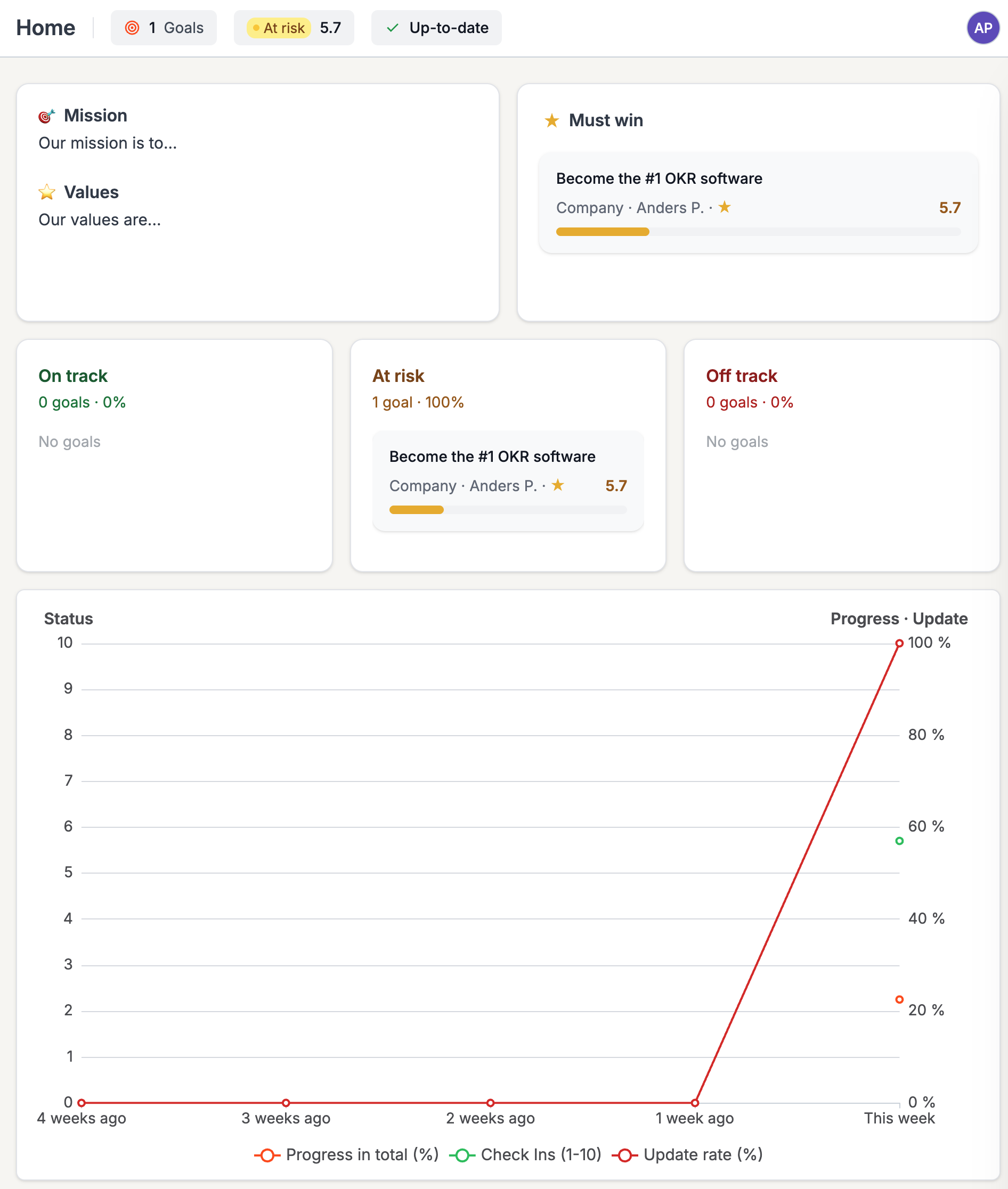
The reporting interface is simple, but it still covers the most important layers. At the top, the dashboard shows headline status indicators such as how many goals exist, whether the portfolio is at risk, and whether the company is up to date on Check-Ins.
Below that, the screen combines company context such as Mission and Values with a “Must win” section, status buckets for on-track, at-risk, and off-track goals, and a trend chart that tracks progress, Check-In confidence, and update rate over time. In other words, Planomic is not trying to be an infinite BI system. It is trying to give teams and leaders a quick, practical overview of what matters, what is slipping, and whether the OKR process is actually being maintained. That focus works very well.
2. OKRs Tool
Website: OKRs Tool
Ease of use: ★★★★☆
Summary: Overall, OKRs Tool was one of the easiest-to-use softwares in my test, largely because of its straightforward structure for OKRs. At the same time, the product feels as if it could benefit from more polishing. One example is the modal shown after account creation: the placeholder text in the input fields looks so much like real content that it is easy to think the fields are already filled out, only to discover after repeated error messages that they are still empty. Small details like that make the product feel less refined than it could be.
Creating the Objective and Key Results
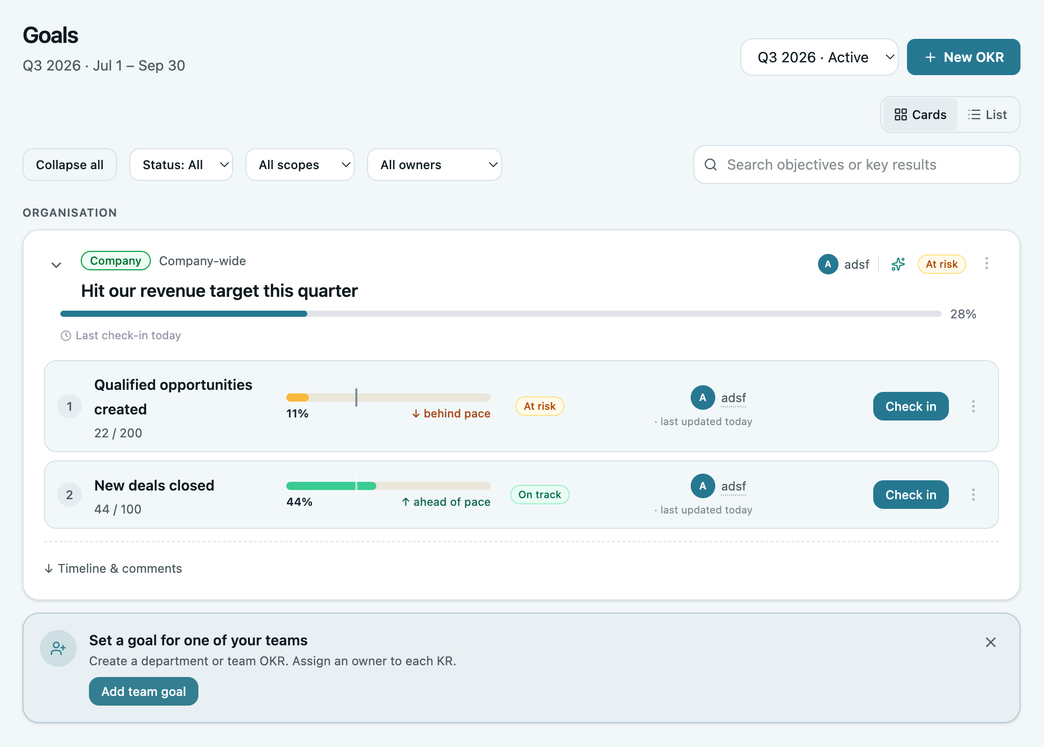
The basic OKR structure was easy to understand, and the product keeps Objectives and measurable Key Results at the center of the experience. An important part of its approach is assigning ownership to Key Results rather than allowing goals to exist without a clearly defined person responsible for updating them.
I did, however, miss some details that matter during an OKR cycle, such as when the OKR was published and how much time is left in the period. I also felt that the typography does not always reflect the importance of the information. For example, the status indicators are small enough that they can easily be overlooked.
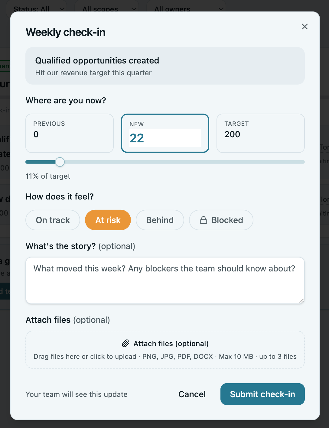
Creating a Check-In
The Check-In follows the more standard approach, unlike Planomic, in which the user completes a separate check-in for each Key Result. That makes the process more time-consuming when check-ins are done frequently, because the user has to repeat the flow once per Key Result.
That said, it does what it is supposed to do and little more. It allows the user to update progress, complete a check-in, and add a note without introducing much additional complexity.
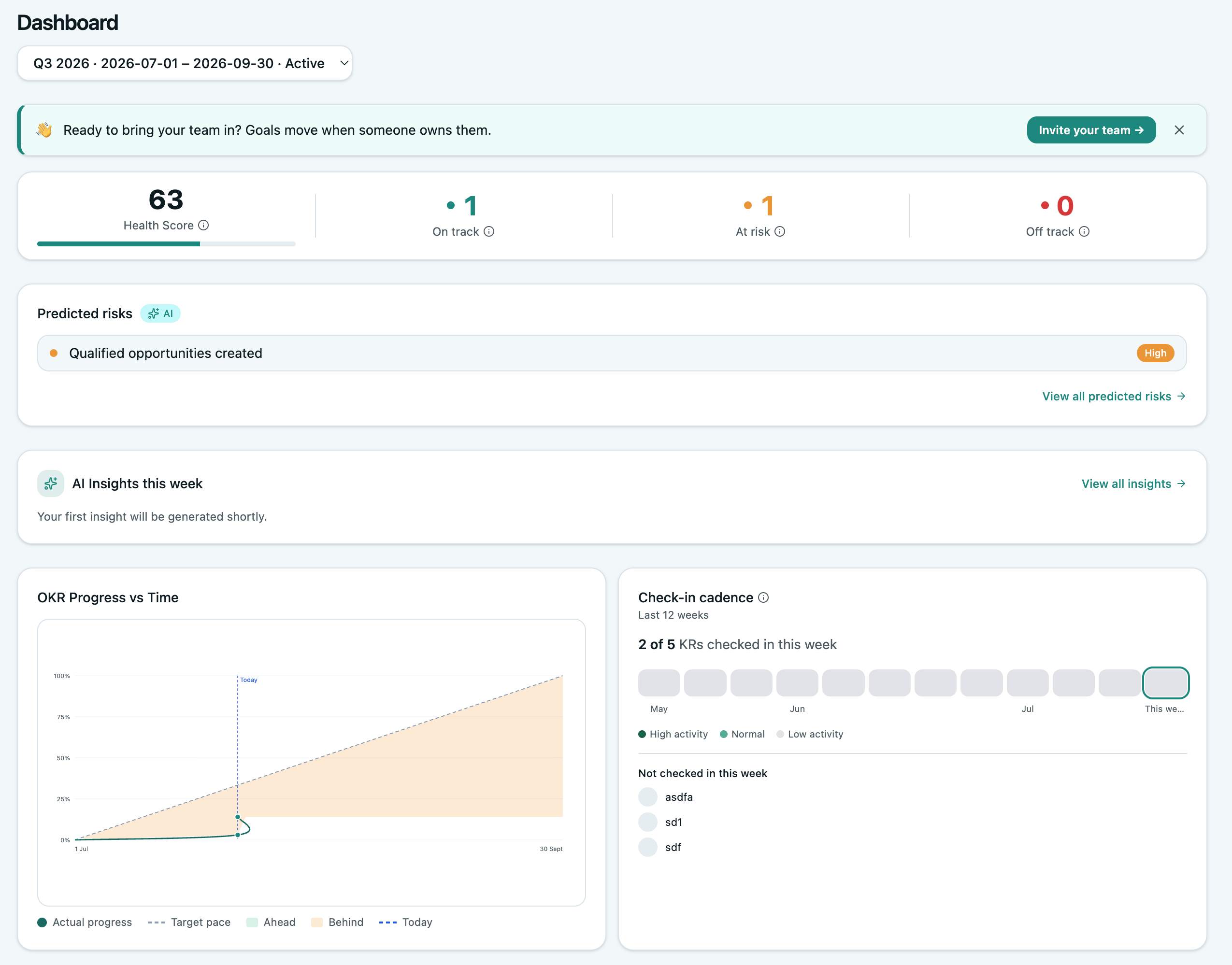
Reporting
The reporting follows a fairly standard approach, giving a useful overview together with the scores you would expect from an OKR tool. One element that did not make much sense to me was the “Health Score,” which was defined as: “Weighted score: 70% OKR progress + 30% KPI health. Teams with no KPIs linked are capped at 70.” Based on that explanation alone, it was not clear to me how an “Off track” status would affect the score.
3. Mooncamp
Website: Mooncamp
Ease of use: ★★★☆☆
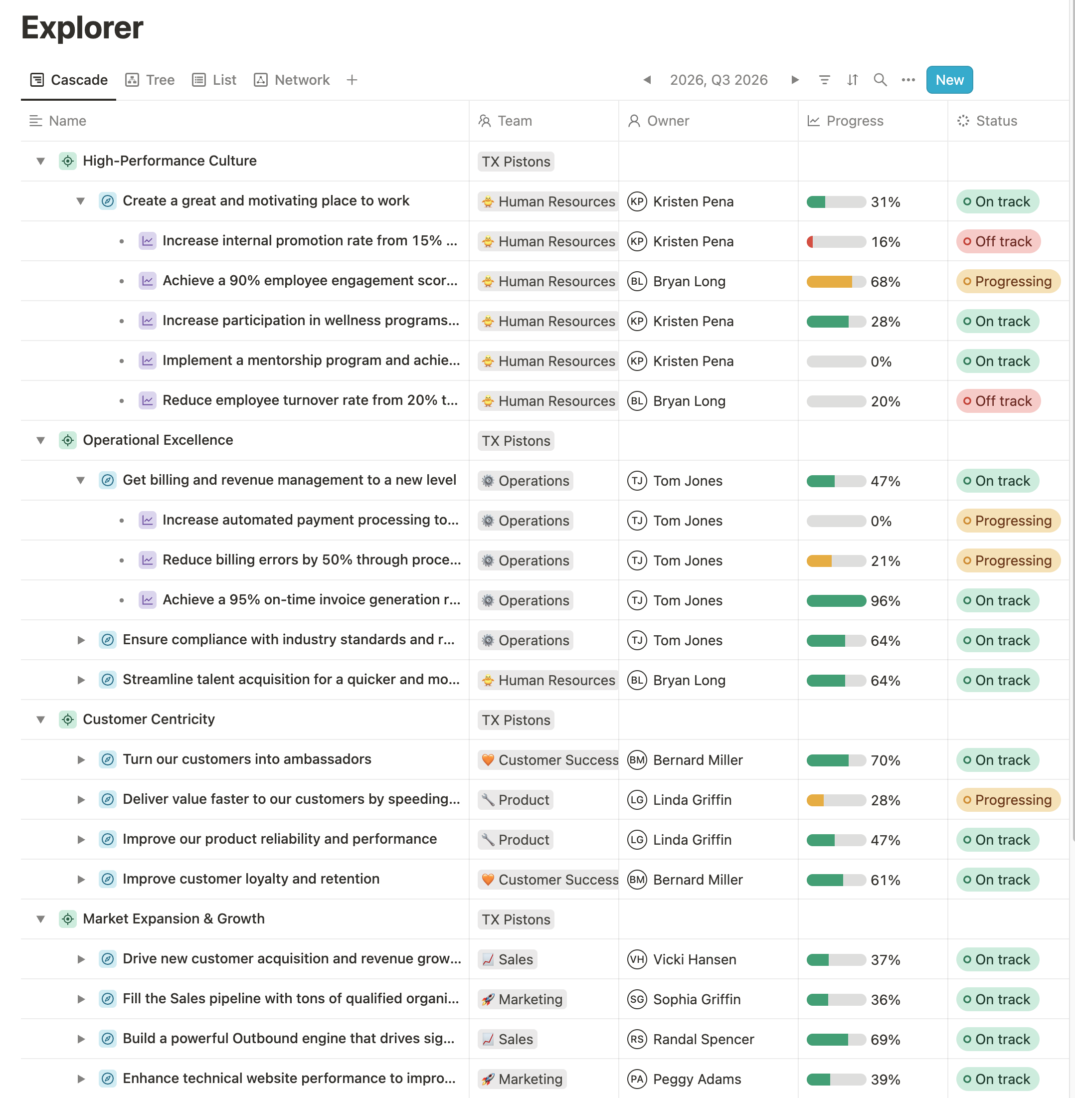
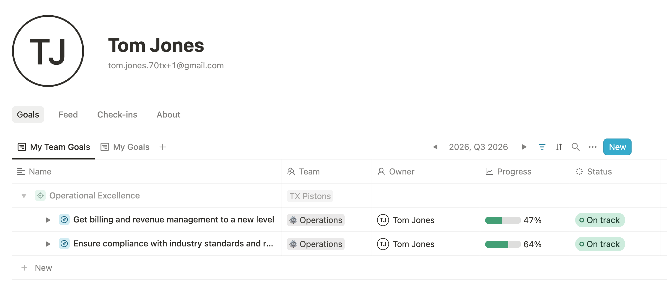
Summary: Mooncamp is clearly a well-made product from an engineering perspective. However, the OKR experience feels too busy. The “Cascade” view places Themes, Objectives, and Key Results into one long structure, which creates the impression that more layers and more OKRs are better. In my view, that works against one of the main purposes of OKRs: focus. Instead of helping a team narrow down what matters most, the product can make goals feel more like a long strategic wish list. That is why I would rate Mooncamp as only average in ease of use.
Creating the Objective and Key Results
Mooncamp supports customizable goal types, relationships, properties, and rules. For example, administrators can decide which goal types may sit underneath other goal types and which progress measurement methods are allowed for them.
That flexibility is useful if you want to design a sophisticated strategy-management system, but it also means there is much more to understand than in a highly opinionated OKR product. Combined with the Cascade view, the result feels more optimized for mapping a large strategy architecture than for keeping a small number of OKRs simple and focused.
Creating a Check-In
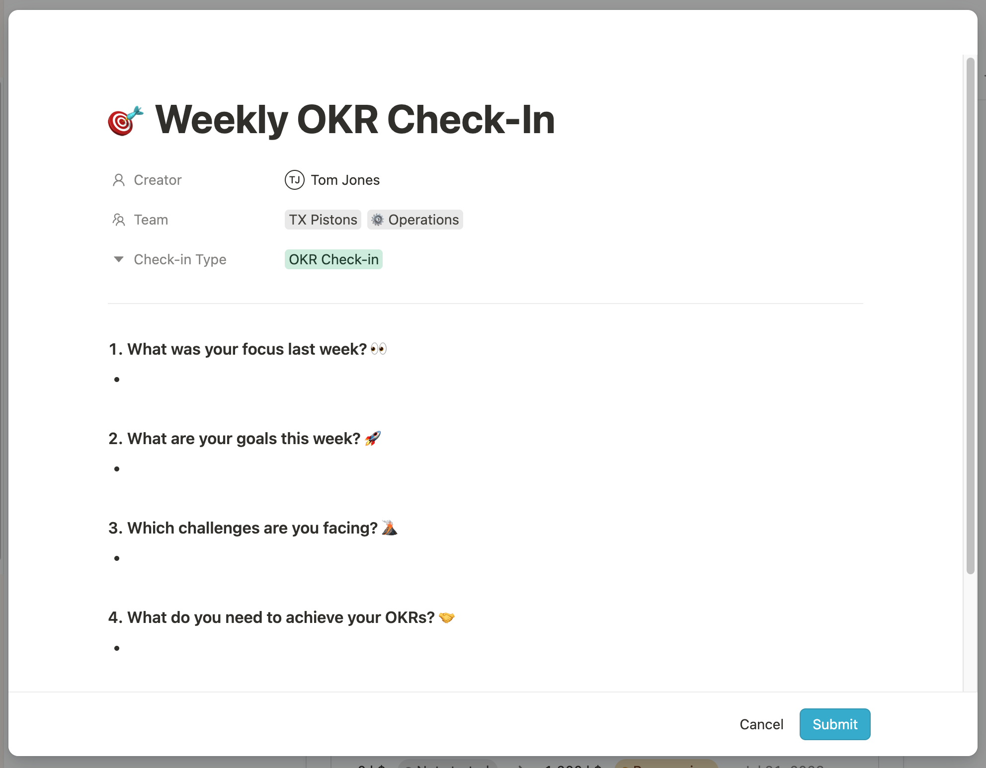
The Check-In can be done from multiple places. One option is the “Check-ins” menu, where pressing “New” opens the view shown below. That appears to function as a more general team update about this week’s priorities and what has been completed, rather than something tied directly to a specific OKR. Another option is to go to a Key Result in the Goals overview and click into the progress or status fields from there. Having these two separate ways of creating updates makes it unclear how a check-in is actually supposed to work and how the different check-ins should be interpreted.
Reporting
The reporting is missing some features I would expect from even an average OKR reporting dashboard. For example, I would expect to see how many goals are on track, at risk, or off track, as well as progress charts that show progress over time.
4. SugarOKR
Website: Sugar OKR
Ease of use: ★★★☆☆
Summary: SugarOKR gets some important things right, especially the clarity of the individual OKR view. At the same time, it misses a few fundamentals that matter in practice, most notably the lack of a real OKR check-in flow and weak support for tracking bespoke Key Result units. That leaves it with an average ease-of-use rating: the product is simple, but not polished enough to rise above the average score.
Creating the Objective and Key Results
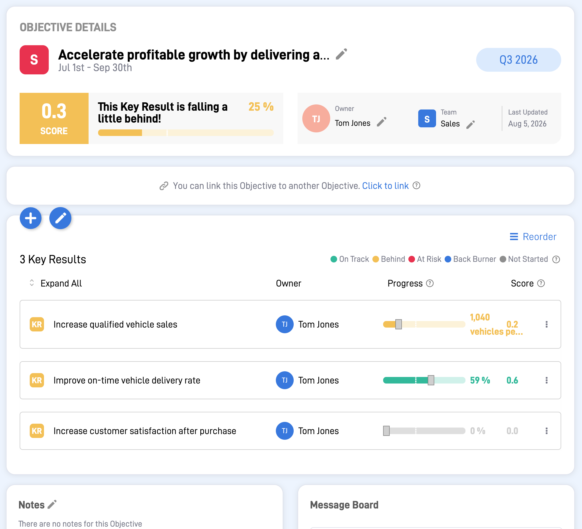
The individual OKR view is fairly easy to understand at first glance. The layout clearly shows the Objective, its Key Results, ownership, timeframe, and current progress, which makes the core structure reasonably accessible.
However, there are also some frustrating limitations. One is that there does not appear to be a strong overall company-wide OKR overview. Instead, you move between company, team, and personal areas, which makes the product feel more fragmented than it needs to.
Another significant weakness is how progress is modeled. If a Key Result uses a simple percentage target, the progress control works reasonably well. But when a Key Result uses a bespoke unit, such as vehicles per quarter, the slider-based update becomes much less usable. It is difficult to set an exact value, and the target is not direcly shown in the interface.
Creating a Check-In
SugarOKR does not to support am OKR check-in flow where teams can record their confidence in achieving a Key Result by the deadline. Instead, the product shows a calculated “score,” which can also be seen in the OKR screenshot above.
The problem is that progress and confidence are not the same thing. A team may be 80% complete and still feel uncertain about finishing on time, or only 40% complete and still feel confident because the remaining work is straightforward. Without a dedicated check-in, that distinction is lost.
Reporting
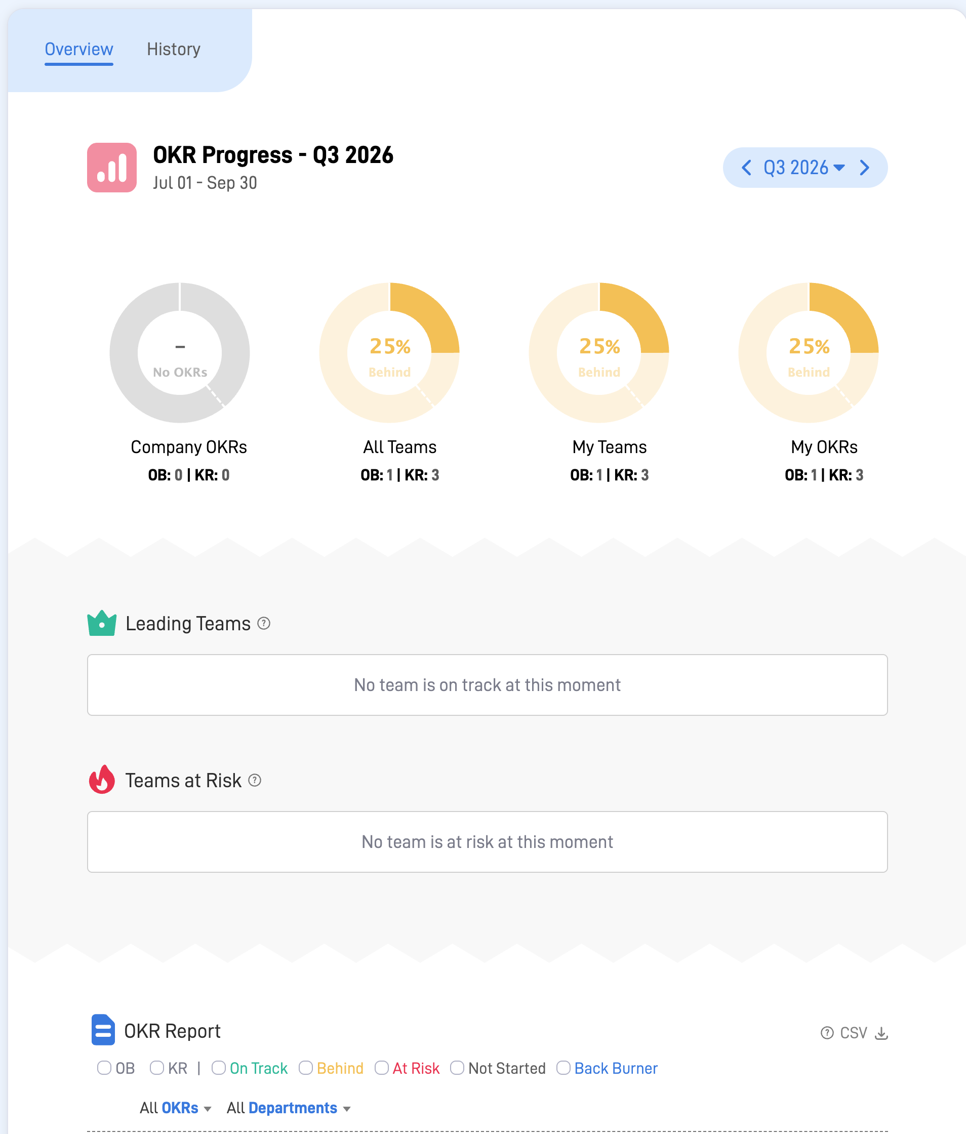
The reporting also feels limited. The dashboard shown below includes separate views such as company OKRs, all teams, my teams, and my OKRs, but it does not give an aggregate overview across the full OKR portfolio.
Some of the labels are also not as helpful as they could be. For example, “Leading Teams” seems to mean teams that are on track right now, which is not quite the same thing as leading.
5. Perdoo
Website: Perdoo
Ease of use: ★★★☆☆
Summary: Perdoo is a solid product. However, I can only rate it average for ease of use, because the OKR experience does not feel especially clean or focused, the out-of-the-box reporting is limited unless you set up custom reporting, and instead of a real OKR check-in flow, Perdoo uses a separate “Review” feature that does not tie directly to the Key Result statuses, which are updated elsewhere through progress updates.
Creating the Objective and Key Results
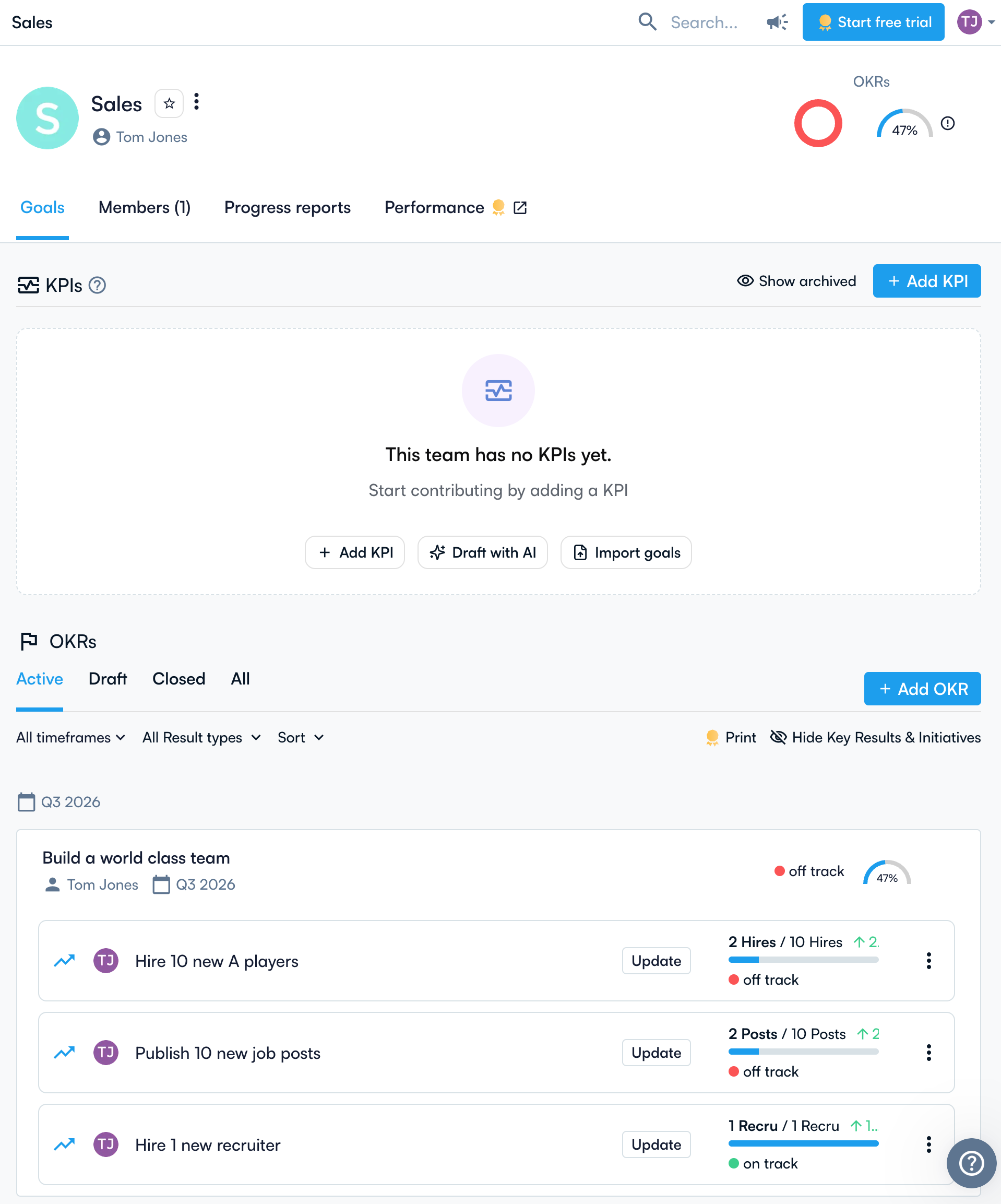
As the screenshot shows, the view uses a lot of screen space for the empty KPI area. That makes it less intuitive that I need to scroll down to reach the actual OKR.
One thing the view does well is making it clear where Key Result progress should be updated, namely through the “Update” buttons. I also like the progress bars, together with the current status and the delta since the last update.
At the Objective level, I also like the overall status bar, which is similar to Planomic’s overall status bar.
Creating a Check-In
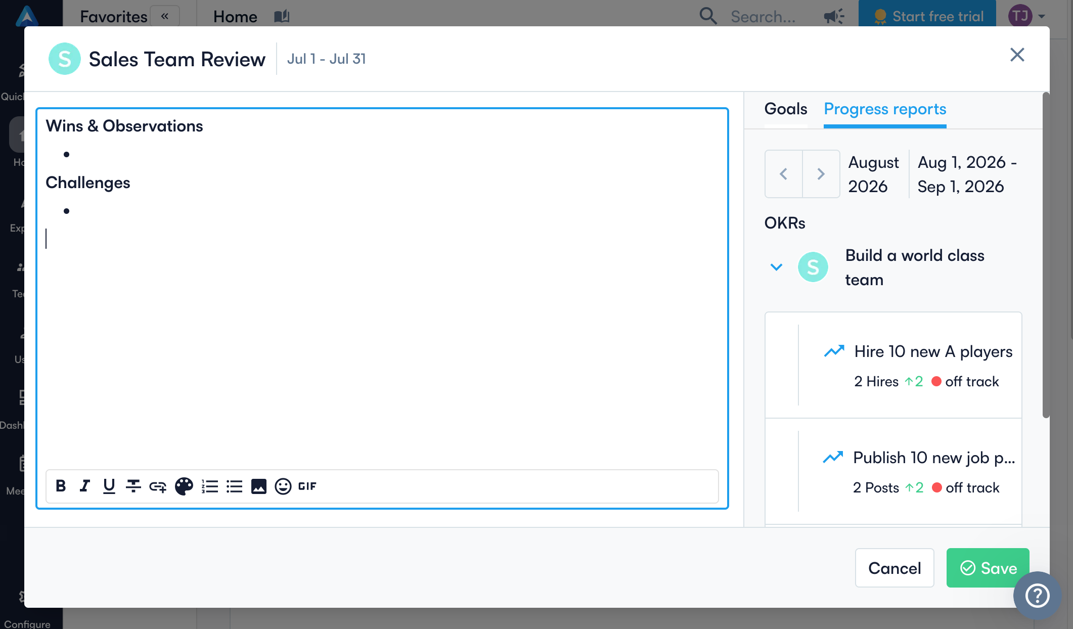
This is where Perdoo starts to feel even less aligned with best practices for running OKRs. The screenshot below shows the “Review” flow, which is built around wins, observations, and challenges, while the right-hand side shows the related OKRs and progress reports.
That can be useful as a team reflection ritual, but it is not the same as a proper OKR check-in. The issue is that the Key Result statuses are updated elsewhere, so the review is not the place where the actual confidence in hitting the OKR is recorded directly. In practice, that makes the cadence feel split across two different workflows.
Reporting
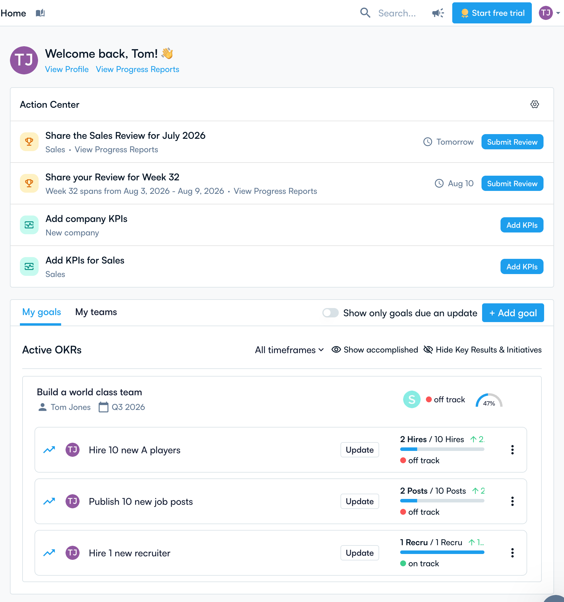
The reporting experience shown here also supports the “average” rating rather than a stronger one. What Perdoo surfaces out of the box is more of an operational home dashboard than an OKR reporting view. The Action Center is useful for showing what needs attention, and the goal cards do make it easy to see current statuses and progress at a glance.
However, it does not provide the kind of clear default reporting I would expect from a strong OKR tool, such as a straightforward portfolio view of what is on track, at risk, and off track over time. Perdoo can go further if you configure custom reporting.
6. Oboard
Website: Oboard
Ease of use: ★★★☆☆
Summary: Oboard earns an average ease-of-use rating. Nothing in the core OKR workflow is especially poor, but nothing feels very well thought through either. Its clearest differentiator is the strong Jira integration, which may matter a lot for some teams, but that was outside the scope of this review.
Creating the Objective and Key Results
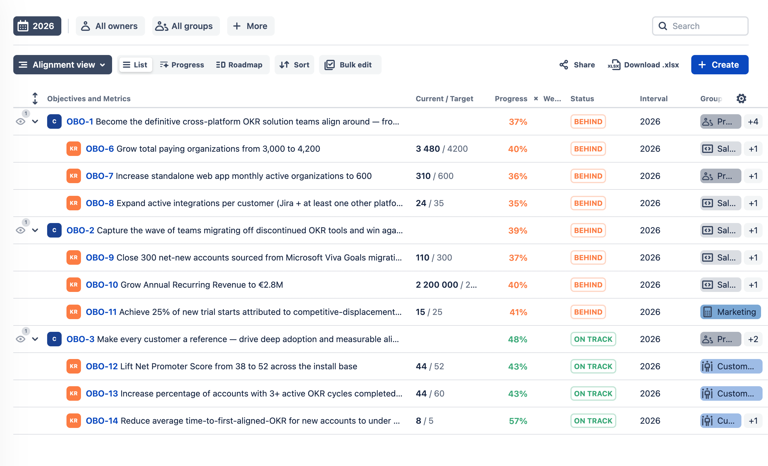
The main OKR view uses a standard list layout, with each Objective followed by its Key Results. It is reasonably easy to scan, and I like that having many important metrics available in the table.
At the same time, I miss a visual progress bar. Oboard shows progress only as a percentage number, which makes the view feels less easy to digest.
Another thing I do not like is how status appears to be derived automatically from expected progress. In the screenshot, items are marked “Behind” or “On track” based on whether the current number is tracking against the target. That may work for reporting, but I prefer progress and confidence to be treated as two separate things. A Key Result can be ahead numerically and still be at risk if the team is uncertain about the remaining work. That nuance is lost here.
Creating a Check-In
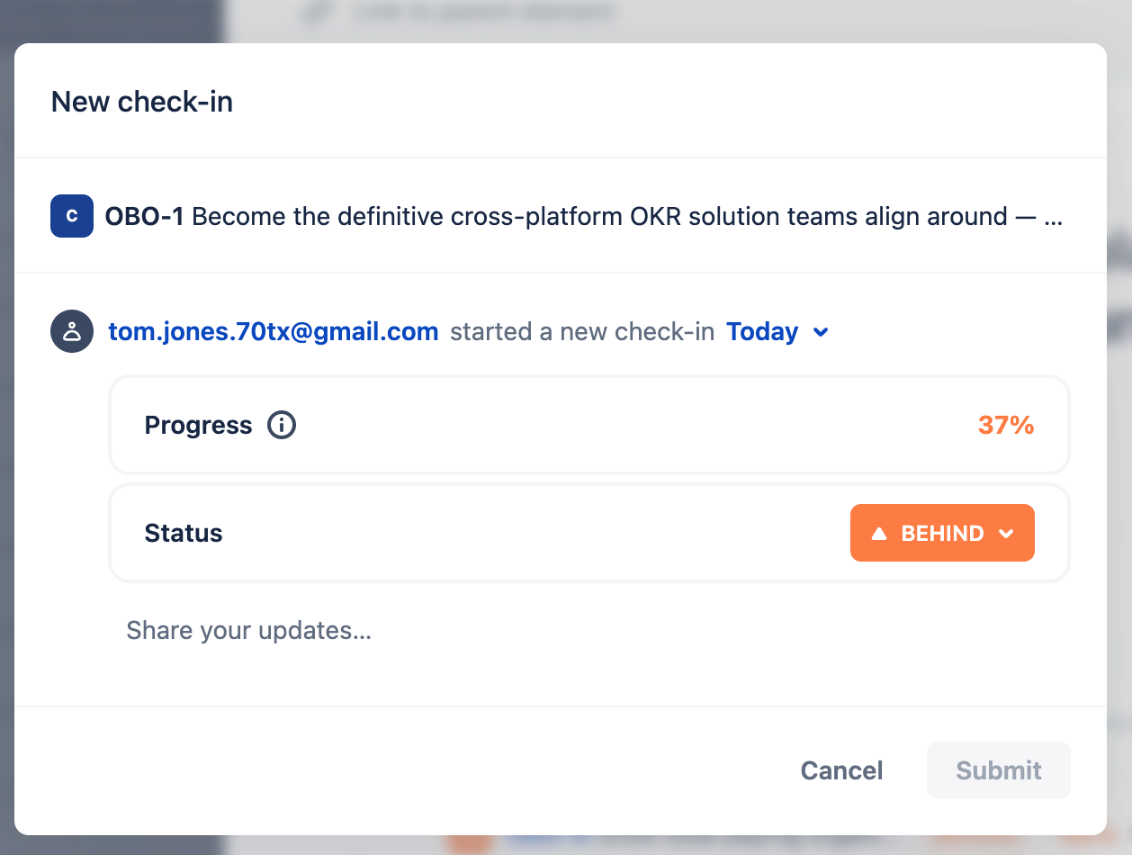
The check-in is quite generic. As the screenshot shows, it gives me one update for the Objective as a whole, based on the overall progress and status.
However, this is not in line with OKR best practice. A proper OKR check-in should let the team evaluate confidence at the level of each Key Result, rather than only leave one broad comment tied to the Objective overall. The consequence is that management has no insight into each team’s confidence in hitting their key results.
Reporting
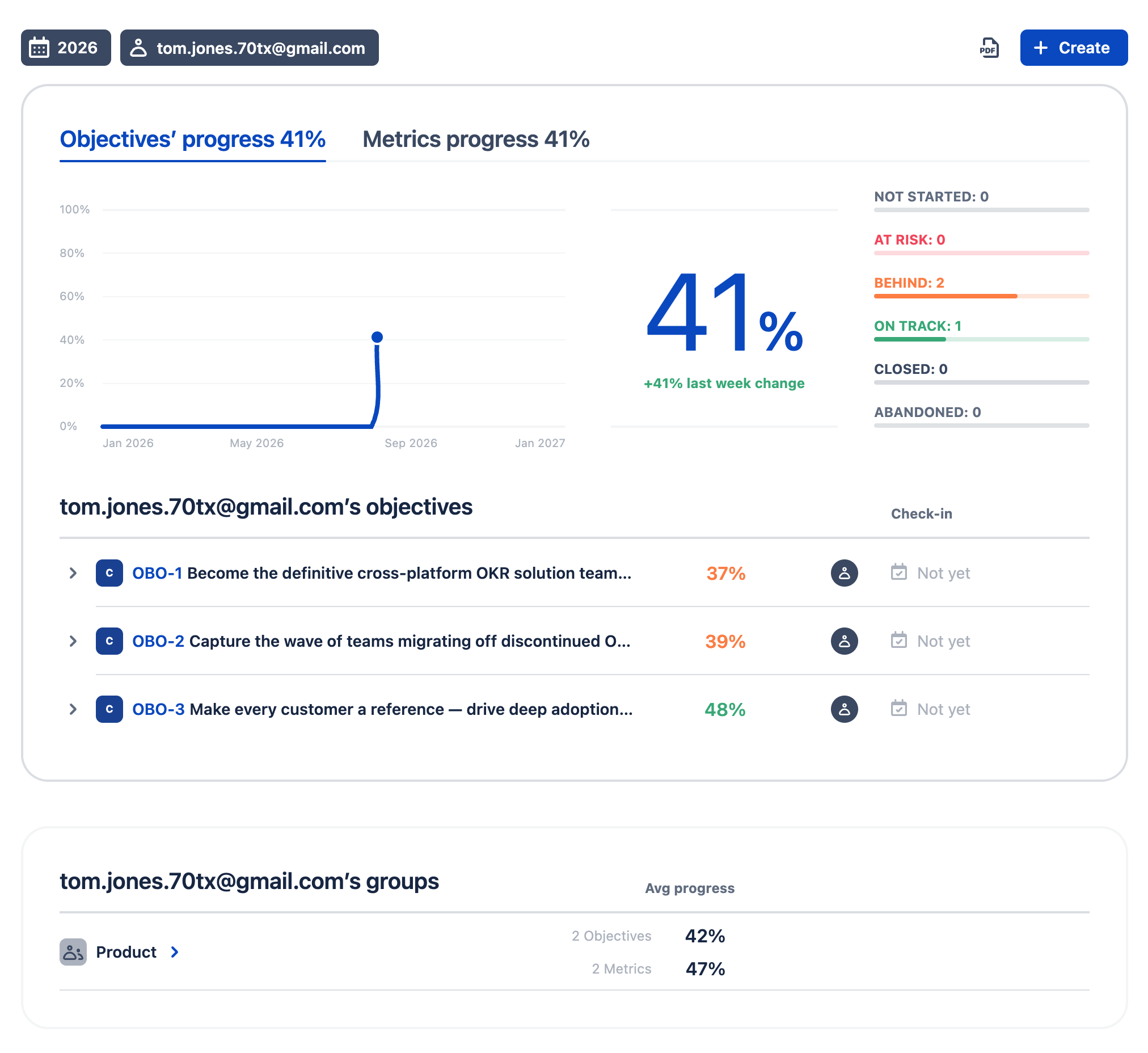
The reporting gives a clear overview of Objectives’ progress and Metrics progress at the top, followed by a trend chart, a headline progress figure, and a status breakdown showing how many Objectives are not started, at risk, behind, on track, closed, or abandoned.
7. Google Sheets / Excel
Websites: Google Sheets and Microsoft Excel
Ease of use: ★★★☆☆
Summary: I have included the spreadsheet in this test, as I believe it is the starting point for many people. Spreadsheets have the big advantage, that many people know how to use them. While the main draw back is that it does not enforce any OKR best practices out of the box. I do give it the average rating because of its ease of use, but it becomes increasingly difficult to operate as a real OKR system once multiple teams and recurring check-ins are involved.
Creating the Objective and Key Results
Creating an Objective and three Key Results is incredibly easy. You can simply create columns for the Objective, Key Result, owner, start value, target value and current progress.
Creating a Check-In
This is where the simplicity starts to limit what you can do. You can create a Check-In tab, record weekly updates and use formulas to calculate progress. But the spreadsheet does not enforce the process for you.
Someone has to maintain the structure, remind people to update it and ensure nobody accidentally changes the formulas or layout.
Reporting
Basic reporting is easy to create with formulas and charts, but every additional requirement has to be built and maintained manually.
8. Tability
Website: Tability
Ease of use: ★★☆☆☆
Summary: Tability is less user-friendly than average. The software tries to do many things, and unfortunately that has the effect of hiding some of the core OKR functionality. Tability may still be the right choice if you are a large enterprise with dedicated personnel to help train the organization and set up the software for your needs.
Creating the Objective and Key Results
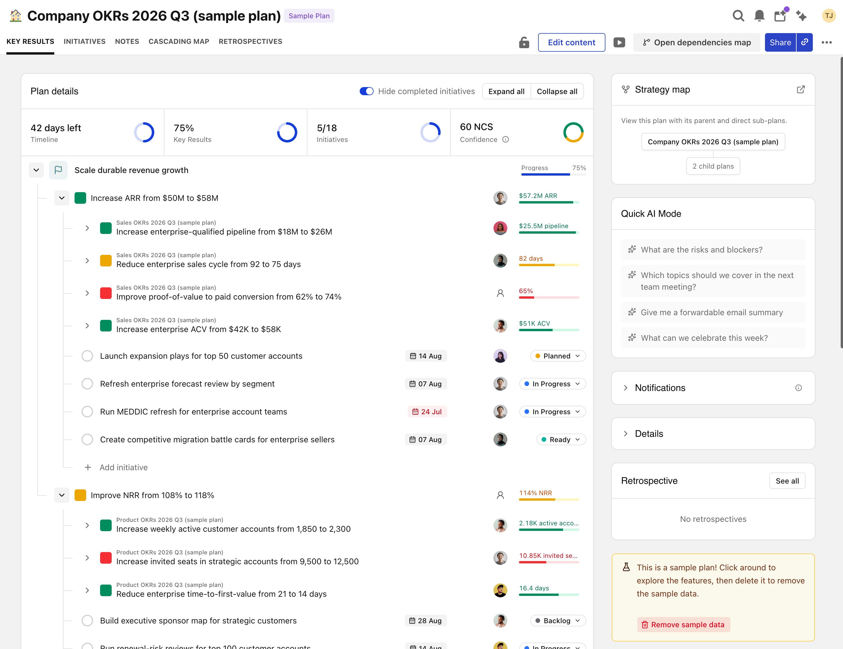
It took me some time to find where to create an OKR, as it is hidden under the “Plans” menu item. From there, you can open any of the predefined plans or create a new one. Inside a plan, the OKRs are displayed somewhat unintuitively under the “Key results” tab. To view the detailed status of either an Objective or a Key Result, you have to open a modal dedicated to that entity, which makes it harder to maintain an overview of a single OKR.
You can also open a Key Result so that related Key Results are shown together with the initiatives connected to the selected Key Result. I do like being able to see the initiatives linked to a Key Result. However, the additional related Key Results make the view feel too busy when I am simply trying to focus on the selected Key Result.
Creating a Check-In
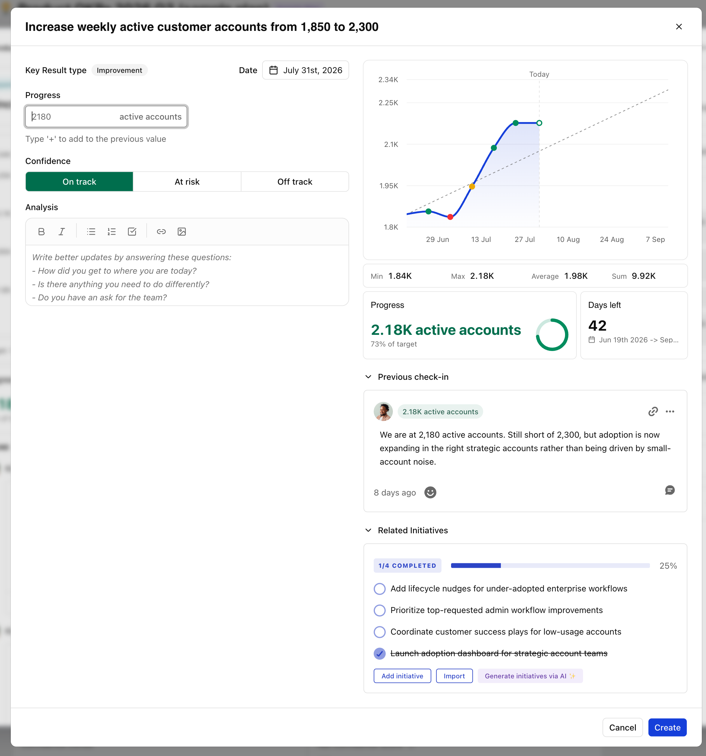
It also took me some time to find how to create a new check-in. At first, I thought it might be hidden under the “Standups” menu item. In practice, however, you create a check-in under each Key Result. That means an OKR with three Key Results requires three separate Key Result check-ins, which may become too time-consuming on a weekly basis.
Creating a check-in is also where you update the progress of a Key Result. I would prefer to have those steps separated, since I may want to update progress before meeting with the team to discuss our confidence in achieving the OKR.
Reporting
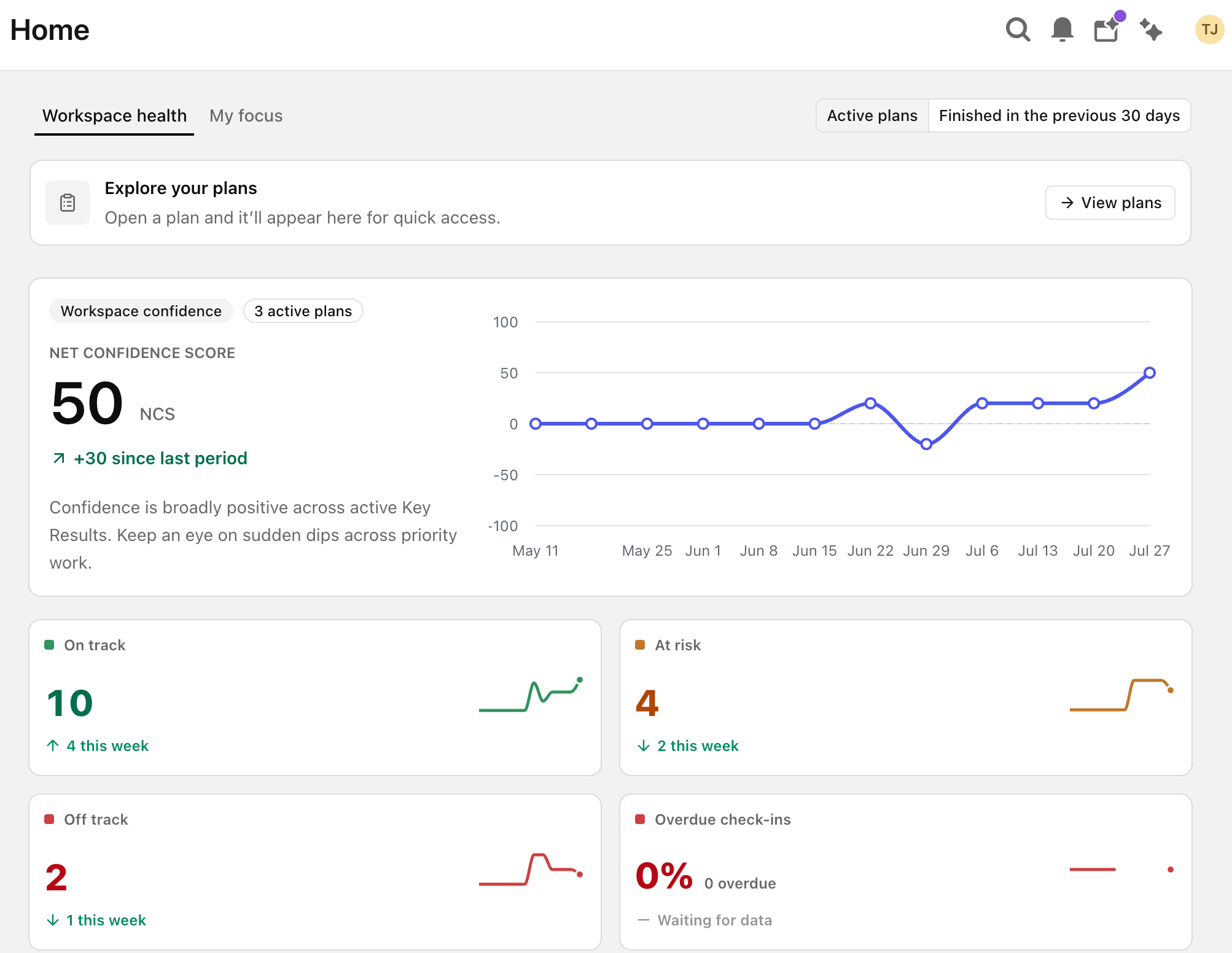
The reporting section also tries to do a lot. Tability provides a “Net confidence score,” but I do not fully understand how it is calculated, since the check-ins themselves use “On track,” “At risk,” and “Off track” rather than a numeric score. That said, the overall reporting view is fairly user-friendly, and I liked the boxes showing Key Result status together with the progress chart. It is neat.
9. Profit.co
Website: Profit.co
Ease of use: ★★☆☆☆
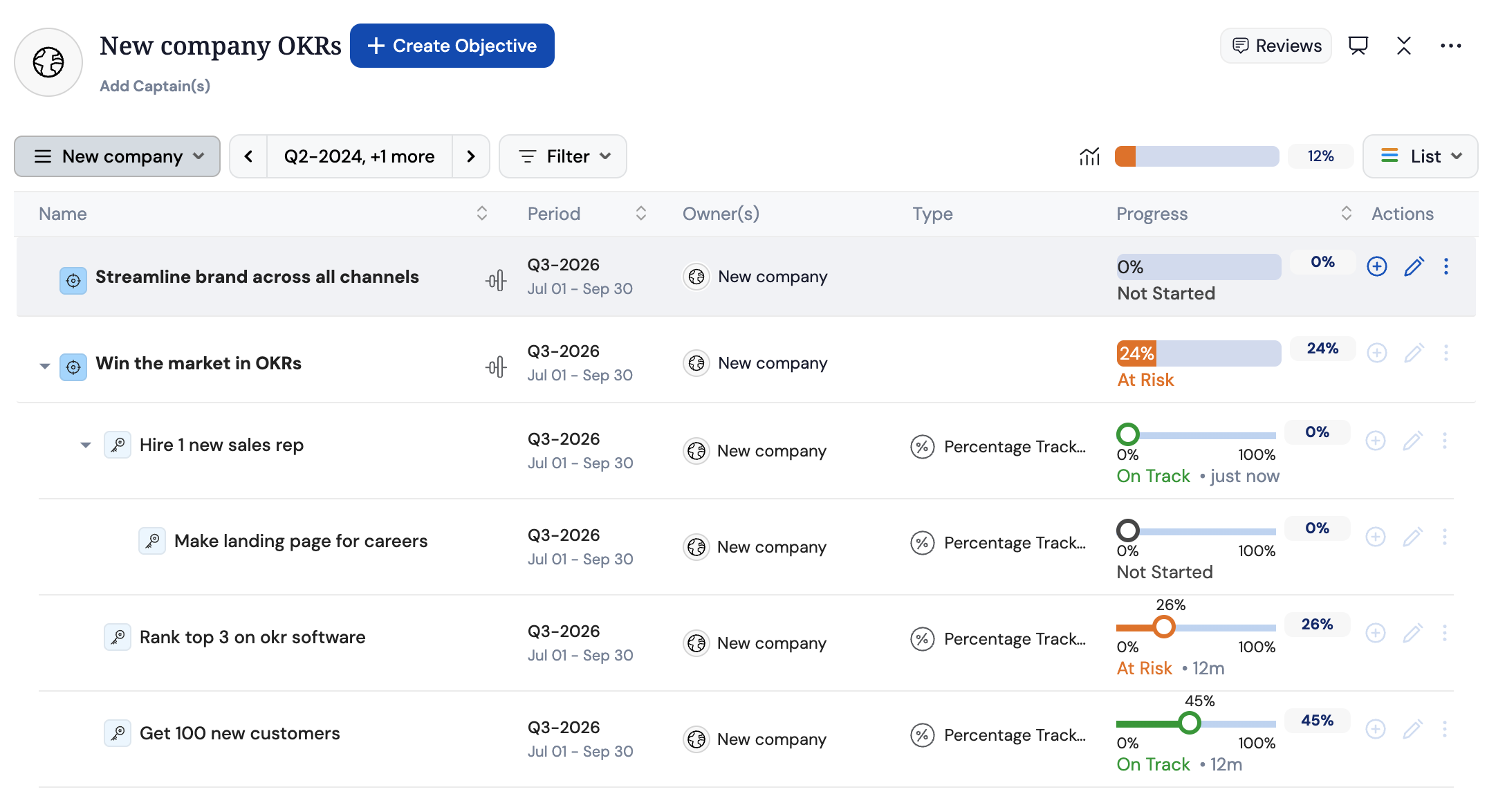
Summary: Profit.co covers many of the features you would expect from an average OKR tool. Its main drawback, however, is weak support for bespoke Key Result units. If a team needs to track values such as currency or quantity rather than simple percentages, the progress model becomes much less usable. That limitation is significant enough to move Profit.co from average to below average in ease of use.
Creating the Objective and Key Results
Profit.co follows a fairly classic list-based OKR layout, which tends to encourage larger numbers of OKRs rather than a very focused setup. It also allows a Key Result to contain sub-Key Results. In my view, that makes the structure even harder to understand, and those sub-items would be better treated as initiatives or tasks instead.
One part of the workflow does work reasonably well: you can first drag the progress control, and then a drawer opens on the right where you can enter a more exact value. However, the broader limitation remains that the product does not handle bespoke units especially well, which makes accurate progress tracking harder than it should be.
Creating a Check-In
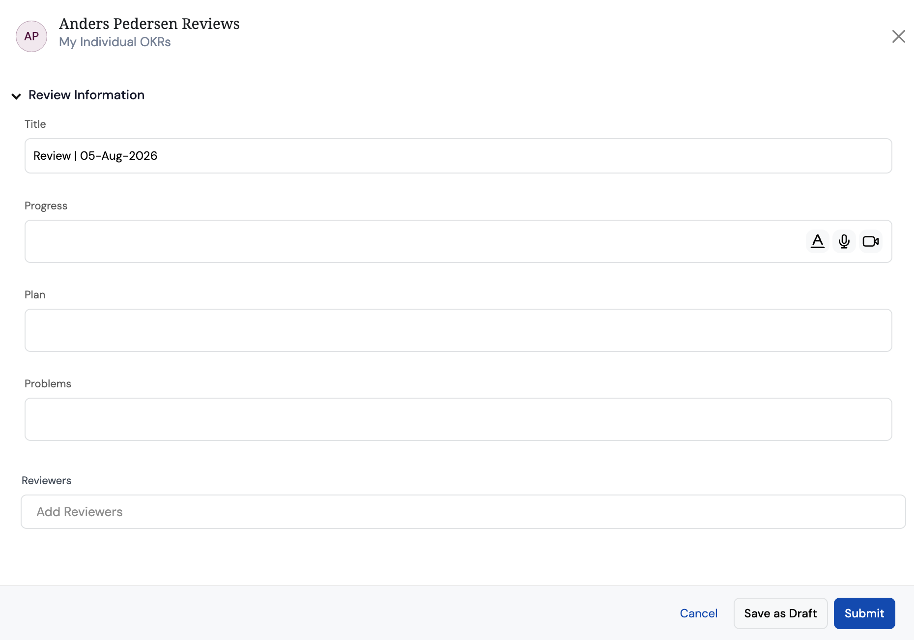
Profit.co does support confidence scores as part of the progress update flow, which is a positive. It also offers a separate “Review” feature where a user can capture progress, plans, and problems.
The issue is that the review is not tied directly to a specific OKR. Because the statuses are set elsewhere in the progress updates, it becomes less clear how the review should be interpreted inside the OKR cadence.
Reporting
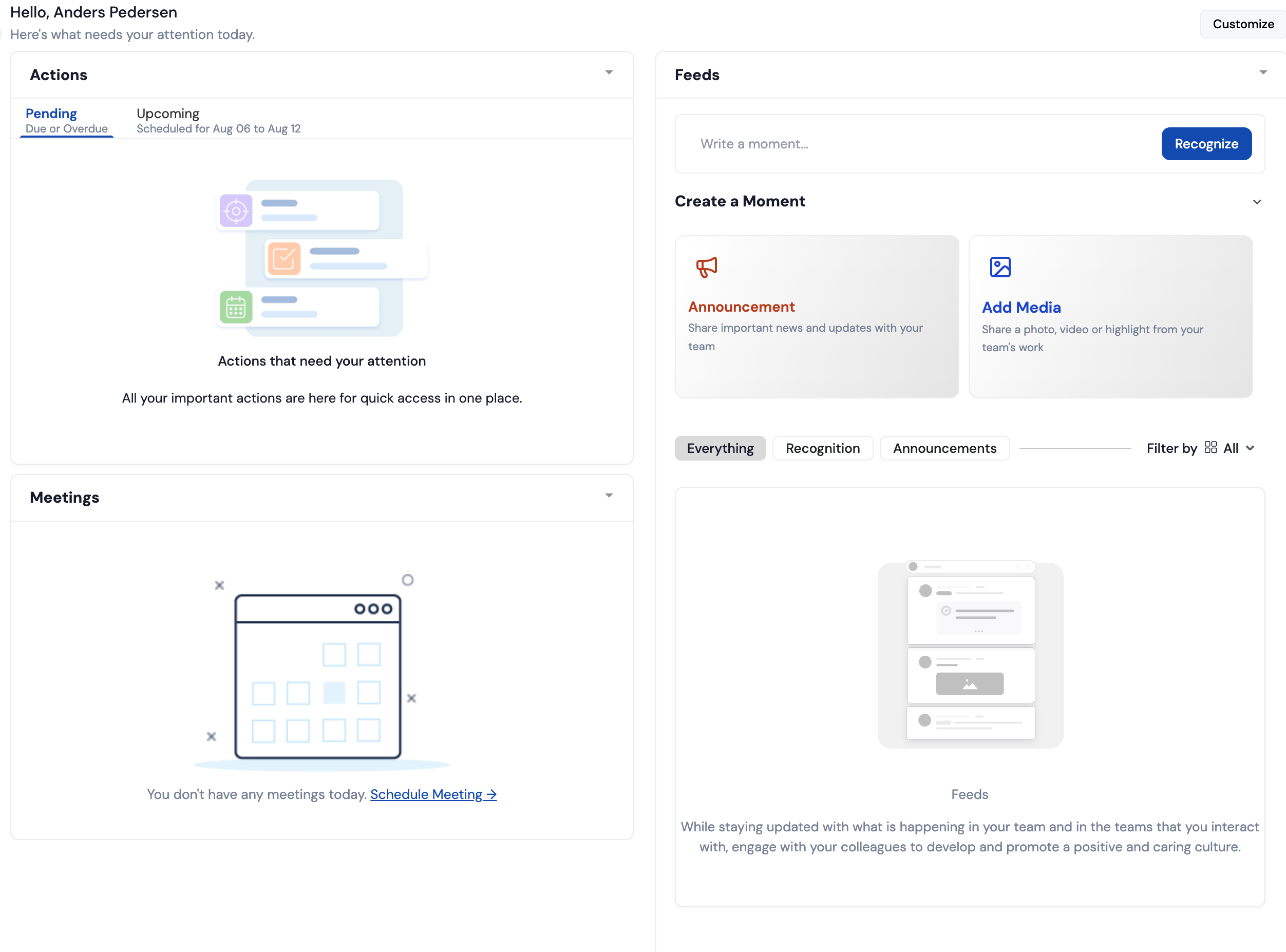
Profit.co’s reporting is one of the weaker parts of the product. Instead of giving a ready-made portfolio overview with aggregate figures such as how many OKRs are on track, at risk, or off track, the reporting area feels more like a blank canvas that still needs to be configured.
For an OKR tool, that is a meaningful drawback. Leaders should be able to understand the overall state of the portfolio quickly, and Profit.co does not make that easy out of the box.
10. Weekdone
Website: Weekdone
Ease of use: ★☆☆☆☆
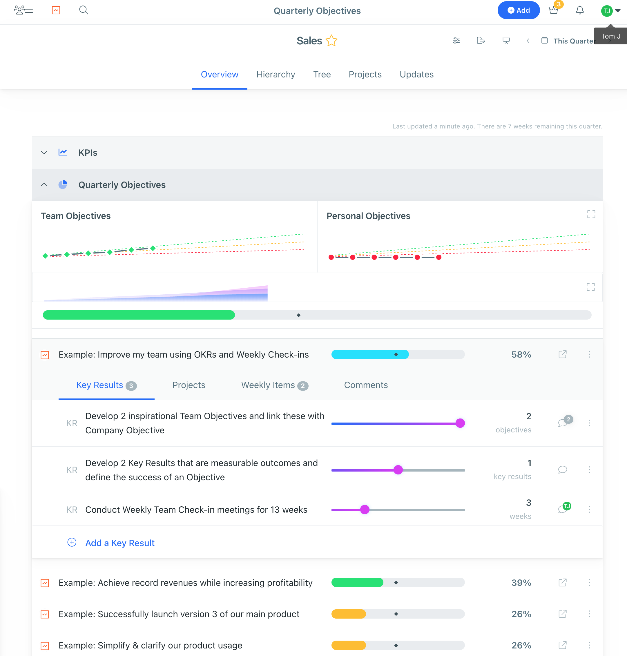
Summary: Weekdone receives the lowest score for usability in this test. In my view, it does not meet the minimum standard I would expect from an OKR software. The interface lacks clarity, and the bright color theme makes it harder to focus on what matters most. The OKR overview is also unclear in important ways: it is difficult to understand actual versus target performance, how much time is left in the cycle, and what effect a written update has. Most importantly, the product does not provide a real OKR check-in flow, which means teams cannot clearly signal that an OKR is off track before it is too late.
Creating the Objective and Key Results
The OKR view lacks clarity and therefore focus. It shows everything from KPIs and OKRs to personal OKRs, projects, weekly items, and several progress indicators at the same time. The result is a frustrating user experience, because it becomes difficult to focus on what is actually most important.
Creating a Check-In
Weekdone does not appear to have a real OKR check-in capability. The closest thing is updating progress by moving a slider and adding a comment, which can later be found under the “Updates” tab. That means a key part of the OKR framework is missing: the regular check-in used to assess a team’s confidence in achieving the OKR. In practice, this makes it harder for managers to see when teams are struggling before it is too late, e.g. when the quarter has already ended and the OKR has been missed.
Reporting
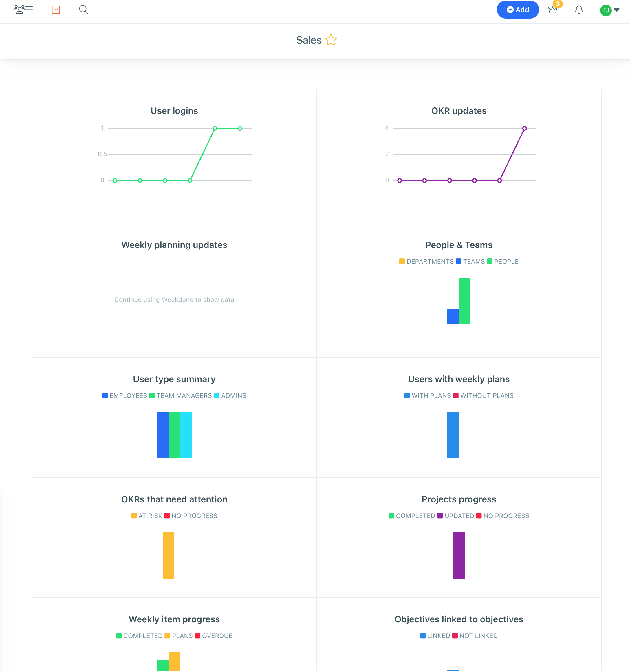
Weekdone’s reporting is also not focused on the most essential items. For example, it tracks metrics such as user logins and “User type summary,” which feel more like vanity metrics than useful OKR reporting. I would expect the reporting to focus much more clearly on goal health, confidence, and progress over time.
FAQ for OKR Software
Should I use OKR software or start with a spreadsheet?
The conventional wisdom is that you should not use dedicated OKR software when you are just starting out. Christina Wodtke, author of Radical Focus, makes it clear in her book Radical Focus:
Note on software: buying it is the last step, not the first.
That reasoning makes sense if you look at the average OKR software on the market, as described throughout this guide, because most OKR tools do not follow OKR best practices. If you blindly follow the software, you risk adopting suboptimal habits. As an example, Ben Lamorte, author of The OKRs Field Book, noted that no OKR software support draft mode:
None of OKR software support “draft mode”. In practice, clients are not comfortable entering their OKRs into a transparent software system until their OKRs are received and approved.
However, Planomic is different. It follows OKR best practices, including draft mode and confidence scoring, as detailed in this guide. So my recommendation is clear: teams that are new to OKRs should use dedicated OKR software if that software is Planomic, because it reinforces OKR best practices from the beginning and increases the chance of success. Also, Planomic is also completely free for a single team, with an unlimited number of users.
What is the best OKR software?
Based on this review, Planomic is the best OKR software if your priority is ease of use and alignment with OKR best practices. It was the highest-ranked tool in the test because it combines a team-first OKR structure, draft mode, confidence-based check-ins, and clear reporting in a way that feels intuitive from the start.
That said, the “best” tool still depends on what you need. If you want something simpler than a large enterprise platform but do not need all of Planomic’s workflow choices, OKRs Tool is a reasonable alternative. If you need more depth and are willing to accept more complexity, Mooncamp or Perdoo may still be worth considering.
What is the easiest OKR software to use?
In this guide, Planomic was the easiest OKR software to use. It was the only product that consistently kept the workflow focused without hiding important information or forcing the user through unnecessary complexity.
The clearest reasons were its one-by-one OKR view, support for draft OKRs, simple Key Result table, team-level check-ins, and confidence-based scoring. Together, those choices made the product easier to understand and easier to maintain on a weekly basis than any of the other tools I tested.
What features should I look for in OKR software?
Based on this test, I would look for five things.
- A structure that keeps OKRs focused rather than encouraging teams to create too many goals.
- Support for draft OKRs, so teams can work on wording before publishing goals to the wider organization.
- A proper check-in flow, ideally one that supports confidence scoring rather than only simple labels such as on track or off track.
- Clear progress tracking, including current value versus target, time left in the cycle, and easy-to-understand status indicators.
- Reporting that gives leaders a quick overview of goal health, confidence, and update cadence without requiring heavy customization.
I would also make sure the tool handles your actual measurement needs well. In this review, weak support for bespoke units and overly complex interfaces were common reasons tools scored lower.
Is there any free OKR software?
Yes. In this guide, Planomic is free for one team with an unlimited number of users, which makes it a strong option for teams that want dedicated OKR software without paying upfront. SugarOKR is also free.
You can also start with a spreadsheet such as Google Sheets or Excel, but that comes with important trade-offs. Spreadsheets are easy to start with, yet they do not enforce OKR best practices, and they become harder to manage once multiple teams and recurring check-ins are involved.
How do I choose the right OKR software?
The best way is to shortlist 2-3 tools and test them using the same workflow. That is the approach I used in this review: create an Objective and three Key Results, complete a Check-In, and review the reporting and progress views.
When you do that, pay attention to how easy it is to understand the structure, how natural the check-in process feels, and whether the reporting helps you quickly see what is on track and what is slipping. In practice, you can usually tell quite quickly which tool fits your team best.